


Enter Password
Led the UX/UI design of an AI-driven collaborative tool that lowers the barrier to data analysis, helping non-experts turn data into clear, shareable insights.
Oct 2022~Dec 2022
UX/UI Designer
datagusto
Figma
Miro
Zoom
Notion
Datagusto, an AI data startup, aimed to design a collaborative whiteboard for non-expert users while preparing to pitch the product to a global, English-speaking audience. Many target users relied on tools like Excel but lacked formal data analysis expertise, making existing solutions feel complex, time-consuming, and inaccessible. The challenge was to simplify data analysis into an intuitive, approachable experience that empowers everyday users.
An AI-powered collaborative platform that simplifies data analysis by generating insights, visualizations, and shareable outputs, making it easy for both experts and non-experts to work with data.
I kicked off the project by aligning with the CEO and CTO to define scope, requirements, and constraints, including a tight deadline for an upcoming pitch. Based on these discussions, I created a project timeline to keep the team on track and conducted a competitor analysis in Notion to inform the design direction.
As the sole UX/UI designer, I led the design process establishing workflows, aligning stakeholders, and guiding the team to ensure an efficient and cohesive product development.
The Datagusto team conducted user interviews to uncover deeper insights, with guidance from me on question design and avoiding confirmation bias. Key pain points included limited time and budget, challenges in sharing data, and uncertainty around how to achieve better analytical outcomes.

"It is time consuming to create ways to display data.”
- D Japan, 20s

"I’m unsure how to achieve the data analysis I need."
- R, Japan, 30s

"My boss often asks me to share data, and manually sharing the Excel file every time can be challenging."
- A, Japan, 20s

"I would like better analysis results, but I can't afford the cost or time"
- M, 40s, Japan
Working closely with the CTO, I developed a high-level information architecture map to structure the product’s core features and user flows, ensuring clarity.
The CTO initially shared rough wireframes created in Miro. I reviewed and refined these concepts, providing UX recommendations to improve structure and usability. Building on this foundation, I transitioned the designs into Figma, developing mid-fidelity wireframes to further define the product experience.
Initial wires
Collaborating with CTO to improve initial wires.
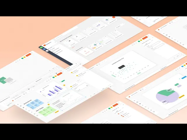
At this stage, I significantly refined the initial low-fidelity wireframes, developing over 28 screens to define the core product experience. Due to time constraints, we also revisited the project scope, prioritizing key features while deferring others, such as the marketplace, for future iterations.
Some of the changes made low-fi to mid-fi stage.
Screenshot of part of the Figma board for Mid-fi screens.
Once the mid-fidelity wireframes were approved, I translated them into high-fidelity designs—applying visual styles, refining interactions, and enhancing overall clarity. The progression from low- to high-fidelity is shown below.

Evolution from low- to mid- to high-fidelity across a single screen.
I created two key user flows to define the core experience: an end-to-end new user data visualization flow and a bar graph flow. These map how users move from onboarding to generating visualizations, helping align the team on key interactions.
End-to-end new user data visualization

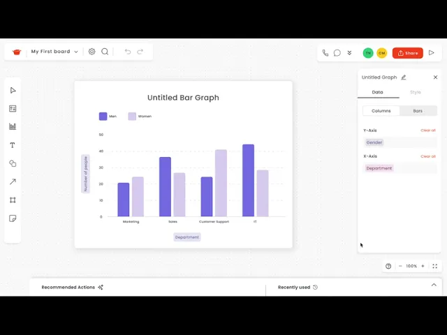
Bar Graph Flow

I developed two high-fidelity prototypes of the above user flows, and handed them off to the development team. Due to tight timelines, user testing was not conducted at this stage but is planned for the next phase. As these are prototypes, some interactions are simplified, but they illustrate the intended functionality and overall experience of the application.
This project deepened my understanding of designing for non-expert users. User interviews revealed that tools like Excel feel intimidating, reinforcing the need for a more accessible approach to data analysis.
A key challenge was shaping an evolving product vision into a clear direction. I took ownership of defining UX/UI processes, establishing workflows, and aligning stakeholders through structured communication.
I also balanced differing expectations around visual design, introducing a more modern UI while maintaining alignment with existing brand guidelines.
What I would improve
With more time, I would have led a more structured research approach, refining interview frameworks and expanding the participant pool to generate more focused insights.
© 2026 Crystal Ma. All rights reserved.